Archive for April, 2012


Experts call for Basking Shark awareness.

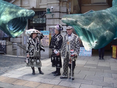
According to the BBC news (science pages) today, basking sharks are drawn to plankton rich surface areas, as our exclusive photo reveals:

20120430-215057.jpg

Apparently it is difficult to predict where and when these plankton banquets will occur, but the beaches of Southend and Clacton are a fair bet.

The Shark Trust has published a code of conduct to be followed in any basking shark encounter, chief among which is the advice “not to startle it”…..although how exactly one is supposed to “startle” a bloody great, seven metre long shark is not specified.

DAVID CAMERON DENIES “GRAND DEAL”

Mr Cameron denied there was any deal with the Murdochs re their business interests, stating “There was no grand deal,” adding “deals with the government cost a lot more than a grand.” We suspect that last bit was said under his breath.

Good evening. . .well, morning really, as I’m writing this at quarter past two in the AM.

I’ve been beavering away with my new adobe photoshop elements 10 (oh, sorry, I just dribbled) and working hard on all aspects of what will be a radical departure from the FANZ covers of yesteryore – and thank god for elements filters as I think it would have taken me twice as long without them 😛

But there it is – I’ve just finished work on the new CD cover for FANZ: Episode 3 (can I sleep now….please?).

A big thank you has to go out to Polly Holt who designed one part of the cover (but I’m not gonna describe it here – you’ll have to wait for the official unveiling :)).

However, I’m so pleased with the cover, I have to give you a sneak peak – here it is (don’t tell Stuart ;)) ;

Sneak peak at new Fanz CD cover


Have a great week and catch up with you all soon 😀

Duncan


Happy Easter everyone!

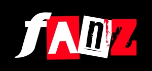
Now that the goddess Astarte has been appeased with her eggs and special crossed bunnage, let us now unveil the NEW FANZ LOGO!!!

Fanz 2012


TA – DA !


We really wanted something that was new and yet still maintained an air of the original.

I thought the Zed from Comedy Punkz would be a good link as this is our flagship title.

After attempting an art deco “N” I decided that a deviant strain version would work well in contrast to the other letters. This is laos, our font of choice for the episode title and known to Doctor who fans as the typeface of choice for nearly all 9th and 10th Doctor merchandise 🙂

I wanted a letter that looked good against a red backdrop and found this typeface called blackout really worked well here.

Lastly, the letter “F” was giving me grief – I knew what I wanted from the other letters but this one evaded me for some time. I finally discovered this font which really struck me a visually interesting.

This is the main design and will no doubt be altered to suit our stories (I know for a fact that it certainly looks a bit more worn on the first release)

Have a great day and let me know what you think (in a nice pleasant productive way, s’il vous plait 🙂

Duncan

duncan@comedypunkz.co.uk


Introducing Mr DunImagecan Wilson, a new contributor to the Comedy Punkz blog.

Duncan not only plays Kris in Fanz but is also a talented artist and graphic designer, (you can find further info about him over on the Fanz Cast and Crew page). We’ve asked him to share with us his production diary as he develops logos, cd covers and artwork for Comedy Punkz. Over to you Mr W….

Welcome to the first of my new production notes. Hopefully, I will be able to keep you posted about all manner of art related stuff while you eagerly (and patiently) await the imminent release of the new FANZ audio series (yes, get a move on with the cover! – Stu).

First off, as a Good Friday treat, here is the logo for @Stuart Robinson’s “Comedy Punkz” ;

Image

I’m sure he will tell you more about ithe company’s ethos if you ask him but we really wanted to capture the spirit of ’77 and the punks creative subculture (more about that here) .

I thought the red zed would look good and highlight that we didn’t give a hoot about the fact that we were using it! Yeah we’re using a Zed instead of an Ess what about it granddad!! 😀

I think the red lines may be optional but for the purposes of the covers it helps it look like a stamped effect and as a consequence is slightly on the skew.

Hope you like it x

DUNCAN

For more information about this, Fanz artwork, theatre set design or graphic art requirements, please contact me at duncan@comedypunkz.co.uk

Oh, almost forgot –  NEW FANZ LOGO UNVEILED ON EASTER MONDAY!!