Happy Easter everyone!
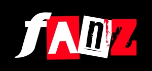
Now that the goddess Astarte has been appeased with her eggs and special crossed bunnage, let us now unveil the NEW FANZ LOGO!!!
TA – DA !
We really wanted something that was new and yet still maintained an air of the original.
I thought the Zed from Comedy Punkz would be a good link as this is our flagship title.
After attempting an art deco “N” I decided that a deviant strain version would work well in contrast to the other letters. This is laos, our font of choice for the episode title and known to Doctor who fans as the typeface of choice for nearly all 9th and 10th Doctor merchandise 🙂
I wanted a letter that looked good against a red backdrop and found this typeface called blackout really worked well here.
Lastly, the letter “F” was giving me grief – I knew what I wanted from the other letters but this one evaded me for some time. I finally discovered this font which really struck me a visually interesting.
This is the main design and will no doubt be altered to suit our stories (I know for a fact that it certainly looks a bit more worn on the first release)
Have a great day and let me know what you think (in a nice pleasant productive way, s’il vous plait 🙂
Duncan
duncan@comedypunkz.co.uk


Great logo! Dynamic and sophisticated, yet fun and unpretentious. Well done Duncan 🙂